- UI/UX
- Graphics
- Branding
Semaphore
Semaphore is a video conferencing app concept that makes heavy use of gradients on its design.
”Semaphore” is an exploration in video conference app design, introducing a vibrant visual experience that defies the conventional norms of typical applications in this category. This approach aims to infuse color and dynamism into the user interface, elevating the video conferencing experience further.
I was particularly fond of bold colors and gradients, and I have decided to use them as the main theme of the app. The inspiration of this homepage is that of a sunset, with the gradient colors of the sky and the sun.
There is not really much of a reason for the large buttons for creating a new meeting or joining a meeting, but I have decided to use them to make the homepage look more interesting and take up more space, as the homepage is quite empty without them normally.
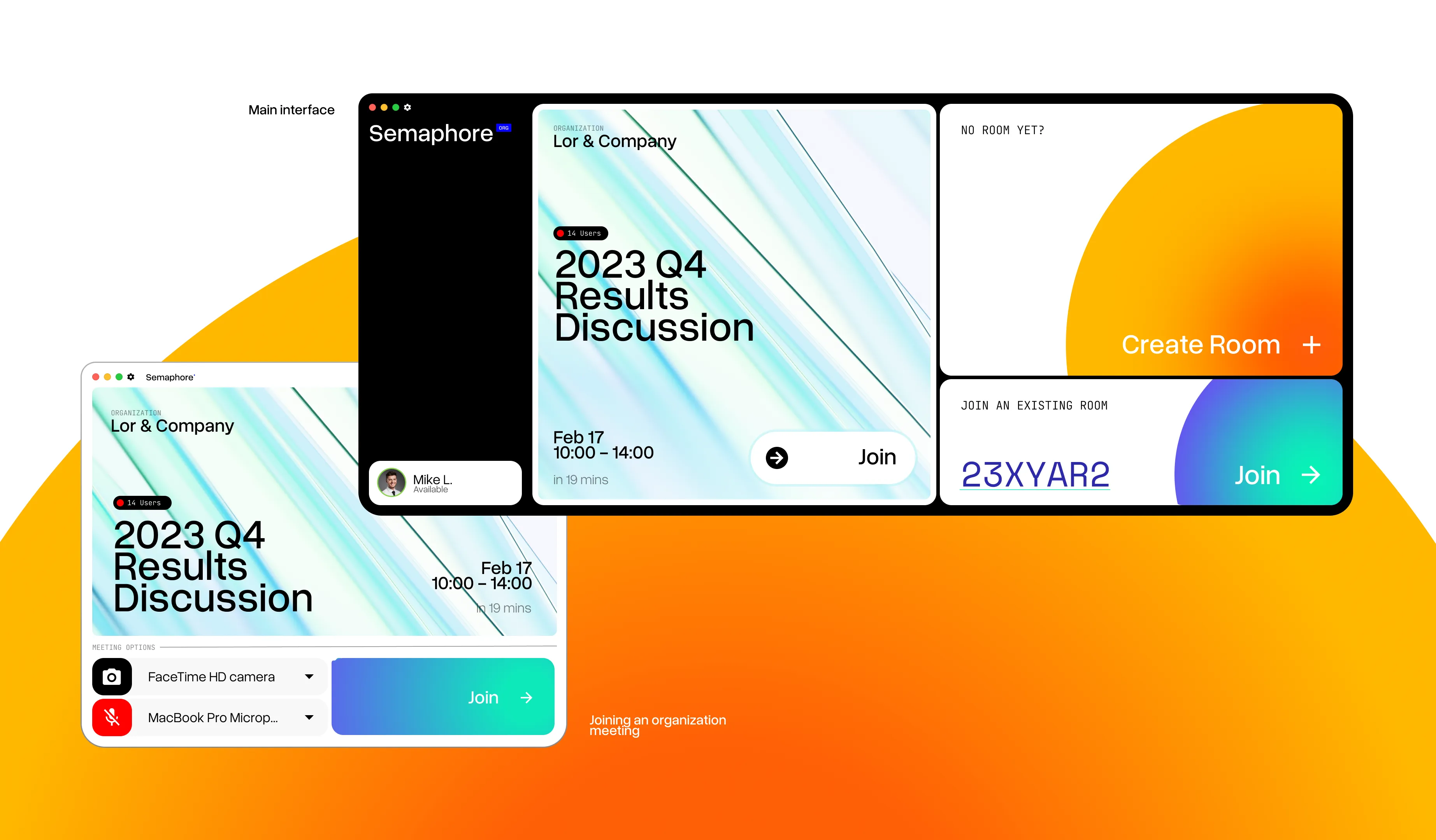
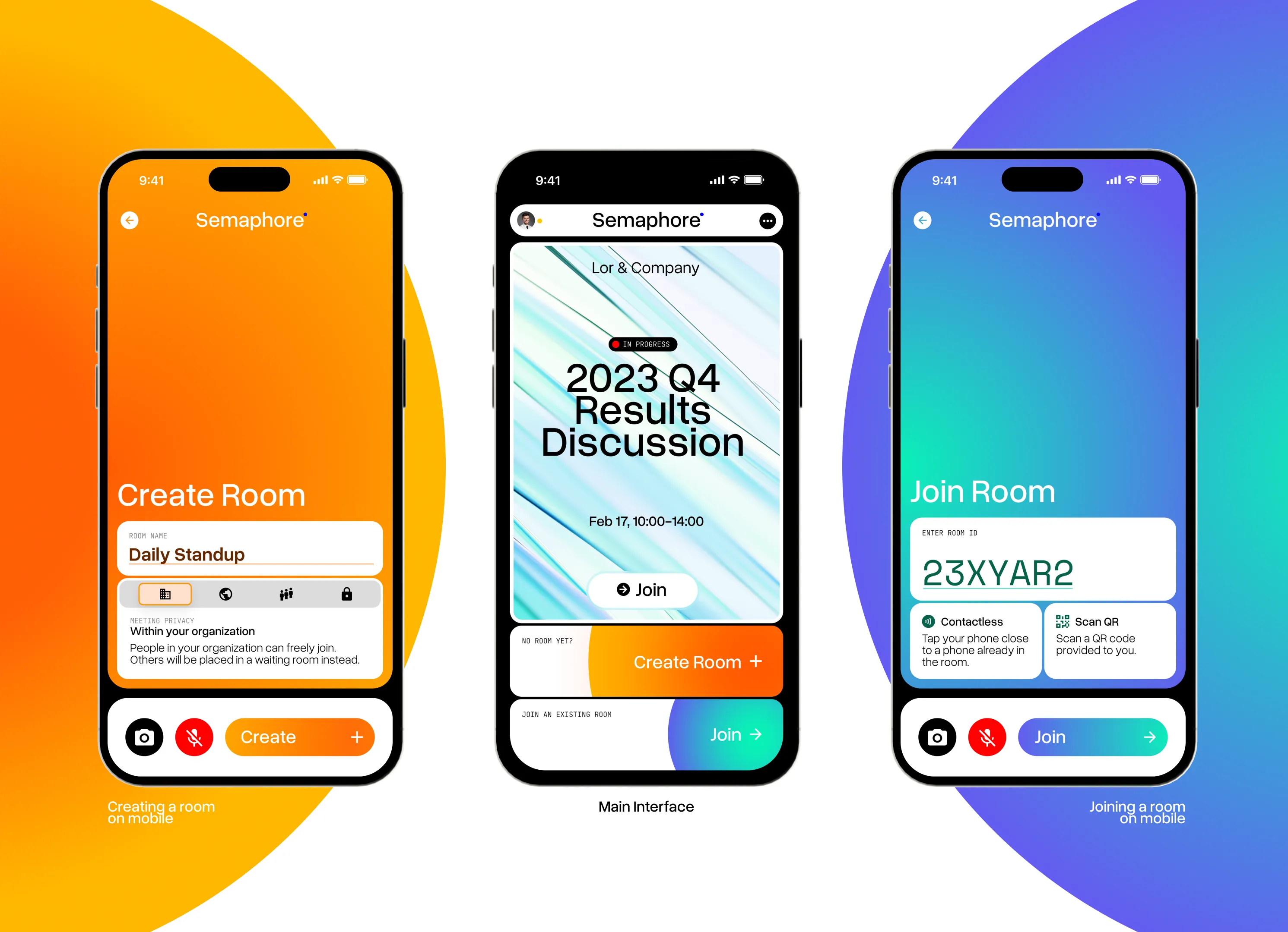
The mobile app is very much 1:1 with the desktop app, with the same color scheme and the same layout. The only difference is that the mobile app has a more compact layout, with the buttons being smaller and the text being smaller as well. The mobile app also has a different layout for the meeting page, with the buttons being at the bottom of the screen instead of the top.
Having a mobile app that is 1:1 with the desktop app is important, as it makes the app feel more consistent and makes it easier for users to switch between the two.
DESIGN EXPLORATION
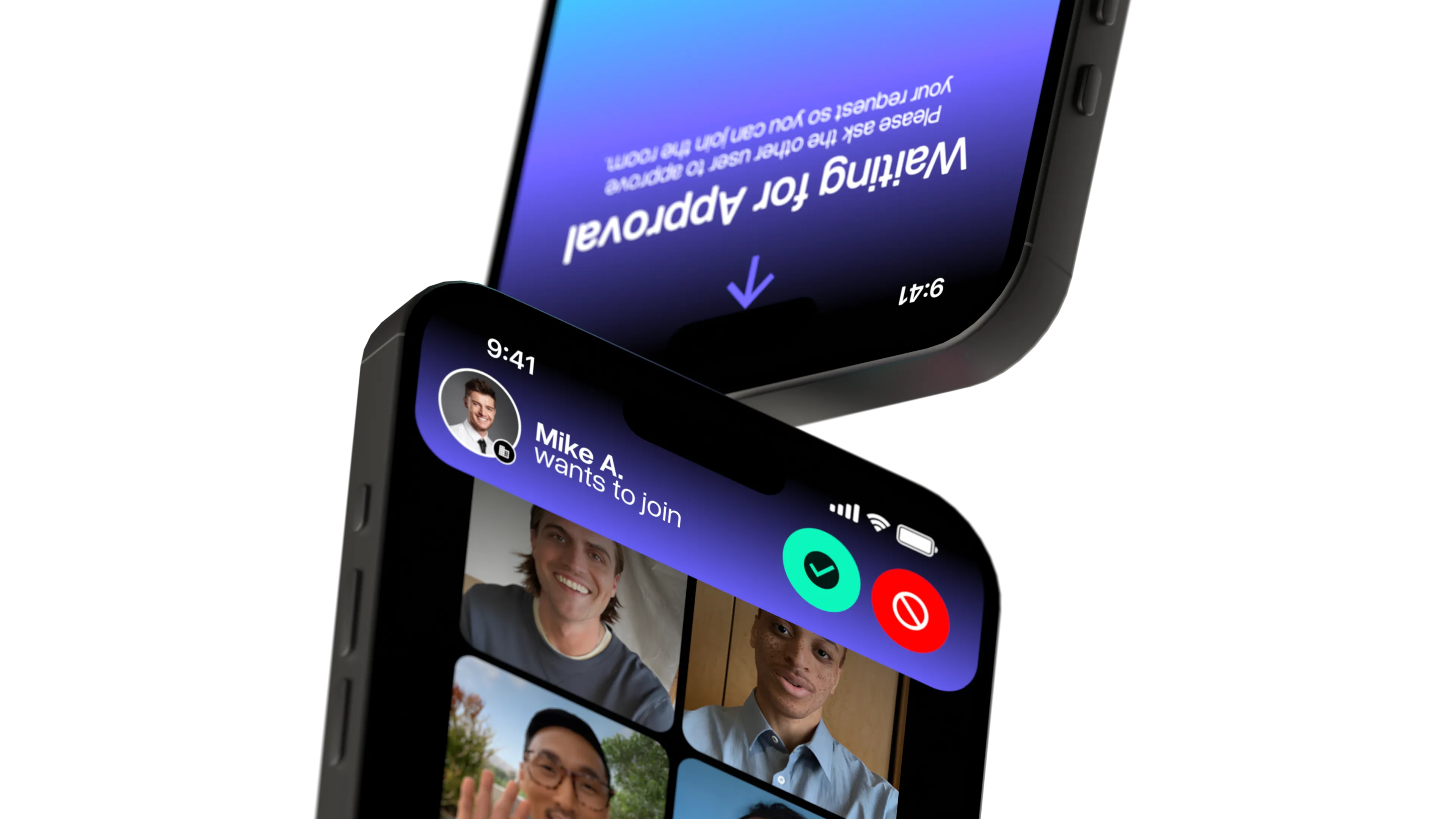
NFC-enabled experiences
With Apple featuring close-contact interactions between phones with the iOS 17 release, I have envisioned a seamless design concept, the first screen flowing smoothly to the other screen.